The visual landscape is changing fast. What you saw as modern just a few years ago may now seem dated. Current visual trends impose new benchmarks, often dictated by digital usage, technical constraints and cultural expectations. Understanding these codes is not just an aesthetic exercise. It's a strategic challenge for your communication, your brand and your credibility.
The studies published by Adobe, AIGA and the Nielsen Norman Group show that visual choices directly influence understanding, recall and trust. So you're not just looking at trends, you're looking at concrete responses to real behaviour.
Visual simplification, not impoverishment
One of the major trends in the news is the simplification of compositions. Fewer elements, more space, clear hierarchies. This approach does not reflect a lack of creativity. It is a response to increasing information overload.
You are exposed to hundreds of visual stimuli every day. The interfaces, displays and media that work are those that reduce cognitive effort. Cognitive science research, particularly at Stanford University, confirms that visual clarity improves information retention.
In graphic design, this logic translates into airy layouts, controlled contrasts and immediate legibility.
The return of expressive typography
Typography is no longer simply a support for the message. It becomes the message. Large typefaces, variable fonts and bold typographic compositions take centre stage.
This trend is based on technical advances in web and digital printing. It's a way of asserting an identity without multiplying the graphic elements. You can see this in the news about brands and the media, which favour a strong, sometimes radical, visual voice.
Analyses by Monotype and Type Network show that typography is now one of the primary factors in brand recognition. In graphic design, it often replaces illustration as the main vector of differentiation.
Contrasting colours and intentional palettes
Bland palettes are gradually disappearing. Today's colours are bold, sometimes unexpected, but always bold. This choice meets a need for visibility in saturated environments.
You'll also notice a more strategic use of colour. Less decorative gradations, more functional contrasts. Each colour has a precise role. Orientation, hierarchy, emotion.
Work by the Interaction Design Foundation confirms that colour, when used sparingly, improves understanding of interfaces and reduces user errors. Today's graphic design is therefore based on thoughtful palettes, not on effects.
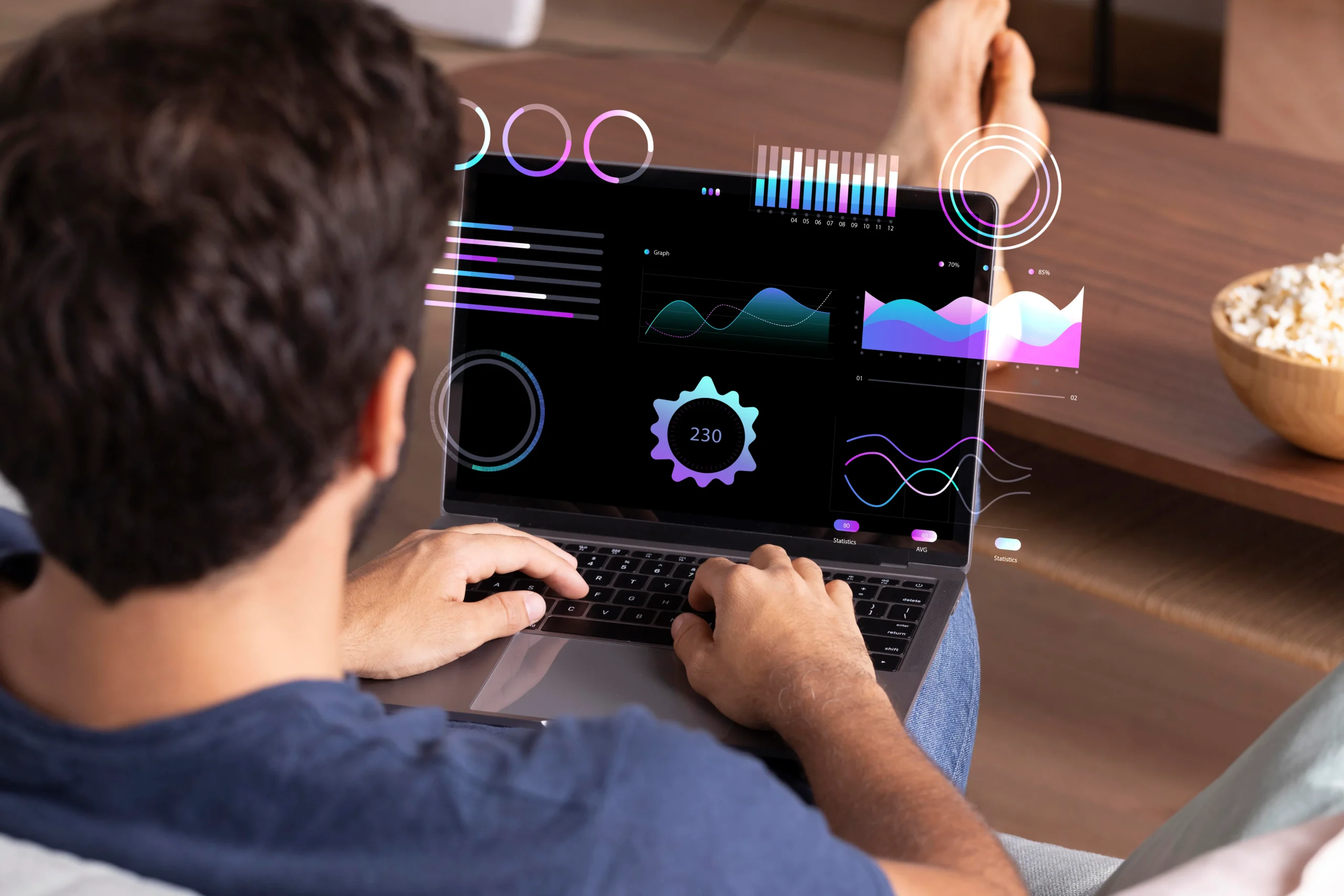
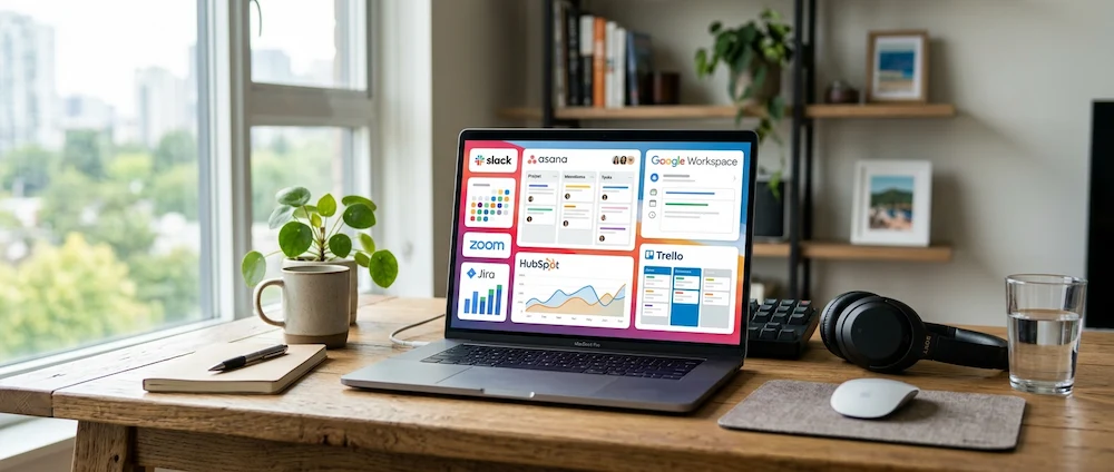
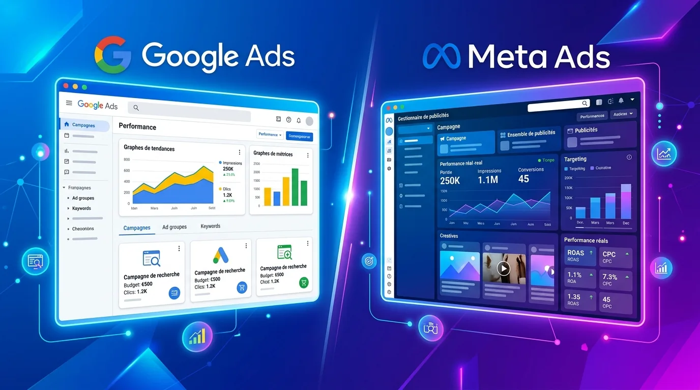
The growing influence of digital interfaces
Print and digital are no longer separate. Interface codes influence all media. Modular grids, simple icons, micro-animations suggested even in static.
This hybridisation can be explained by the amount of time spent on screens. Your eye is now trained by applications and websites. The codes that work are those that you understand instinctively.
UX reports from Google and the Baymard Institute show that consistency between media improves perceived confidence. Graphic design is therefore aligned with interface logic, even off-screen.
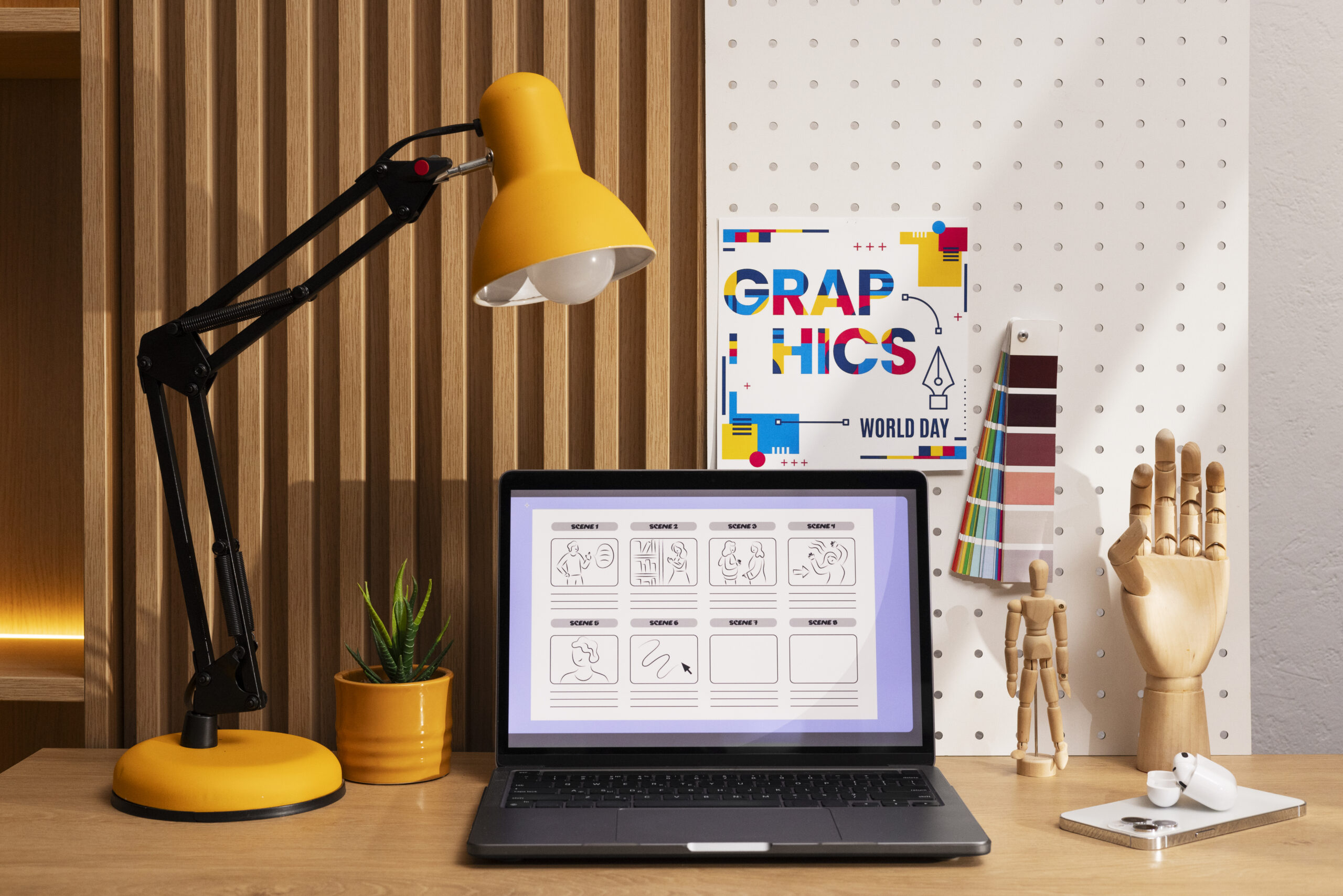
Stylised illustrations and narrative identity
Illustration is enjoying a renaissance, but in a more conceptual form. Gone are the days of detailed realism. Make way for simplified forms, sometimes naive, often symbolic.
This approach allows you to tell a story without imposing a single interpretation. You can project your own reading, which strengthens engagement. The major platforms and technology start-ups make extensive use of this lever.
According to studies published by Dribbble and Behance, illustrated visuals increase attention time when they are consistent with the overall identity. In graphic design, illustration becomes a narrative tool rather than a decorative element.
More responsible and conscious design
Current visual trends also reflect societal concerns. Sobriety, sustainability, accessibility. These notions influence our graphic choices.
You're seeing the emergence of compositions that consume less energy on screen, contrasts designed for visual accessibility, and formats that last longer in print. This movement is not ideological, it's pragmatic.
The W3C and WHO recommendations on visual accessibility are increasingly being incorporated into the creative process. Graphic design is no longer just about seducing, it must also respect.
The central role of movement and rhythm
Even on static supports, movement is suggested. Diagonal cuts, repetition, visual tension. On digital, micro-animations are becoming standard.
This visual rhythm guides the reading and structures the experience. You no longer read a visual in a linear fashion. You move through it. This logic comes directly from eye tracking research.
Tobii studies show that visual journeys are more effective when the eye is accompanied. Today's graphic design incorporates movement as a language in its own right.
Graphic design
Understanding the visual codes that dominate the news allows you to make informed choices. It's not a question of applying trends mechanically, but of understanding why they emerge and how they respond to specific uses.
Le design Today, graphic design is as much an analytical tool as a creative lever. It reflects behaviour, technological constraints and cultural expectations. By integrating them with discernment, you can build communications that are more accurate, more legible and more sustainable.
Trends come and go. Logic remains. And they are what give coherence to your visual choices.


