

You have a quality product or service. You know it can help people. Yet visitors arrive on your site, look around, and leave without taking any action. This scenario is more common than you might think. The reason, in the majority of cases, is not your offer. It's your landing page.
A well-constructed landing page can turn a curious prospect into a convinced customer. A poorly constructed landing page can turn away even a hot prospect. Understanding what makes the difference is what this article is all about.
What a landing page really is
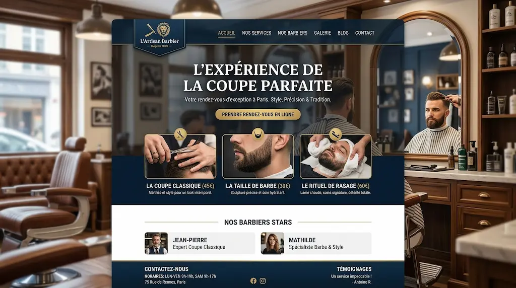
A landing page is a web page designed with a single objective: to move the visitor to action. This action can be a purchase, a registration, a download or a contact. Unlike a traditional home page, the landing page eliminates distractions and guides attention to a single conversion point.
Le Nielsen Norman Group, a world leader in web ergonomics, has shown in its studies of user behaviour that Internet users rarely read full text. They scan. They look for visual cues and clear messages. An effective landing page takes this into account.
The hook: your first and only chance
You have between three and five seconds to hold a visitor's attention. This fact, documented by research into cognitive sciences applied to the web, changes everything. The main title of your landing page should immediately answer an implicit question: «What's in it for me?»
A headline like «Welcome to our site» is a missed opportunity. A headline like «Double your online visibility in 30 days» speaks to your visitor, to their problem, to their expectations. The difference isn't stylistic. It's strategic.
Your tagline should contain your main promise. It should be short, to the point and focused on the benefit. Not about you, not about your company. On him, the reader.
The value proposition: what makes you indispensable
Immediately below the teaser, your landing page should develop your value proposition. This is the time to explain what you offer, who it's for and why it's the best option available.
Don't confuse features with benefits. A feature is what your product does. A benefit is what it changes in your customer's life. Research into consumer psychology, particularly Cialdini's work on influence, confirms that purchasing decisions are first and foremost emotional before rational. Your value proposition must speak to both.
In concrete terms, ask yourself this question before you write: «Why should my ideal customer choose this solution over another?» The answer to this question is your value proposition.
Social proof: what others say
You can say anything you like about your offer. Your potential customers are more likely to believe what other customers say. This is one of the best documented cognitive biases in social psychology: social proof.
On your landing page, include authentic testimonials, concrete figures, recognisable customer logos or certifications. An effective testimonial is not a generic phrase like «Great service, I recommend». It's a short story about a problem encountered, the solution provided and the result achieved.
Analysis platforms such as Trustpilot or BrightLocal's studies on online reviews regularly show that more than 85 % of consumers trust online reviews as much as personal recommendations. Social proof is not a luxury on a landing page. It's a necessity.
The call to action: the element that sets everything in motion
The call to action is the button or link to which you guide each visitor. It's the most decisive element of your landing page. And yet it's often the most neglected.
A good call to action is visible, clear and action-oriented. «Click here» says nothing. «Download your free guide» says exactly what's going to happen. The wording must be specific. The colour must contrast with the rest of the page. The placement must be strategic: above the waterline so that the visitor doesn't have to scroll, and repeated after each block of arguments.
A/B tests carried out by specialist tools such as Unbounce or Hotjar regularly show that changing the wording of a button can increase the conversion rate by 20 to 40 %. This is not anecdotal evidence.
Design and visual hierarchy
Le design of a landing page is not a question of aesthetic taste. It's a question of perceptive psychology. Your page layout must guide the visitor's eye in a natural way, from the title to the arguments, then to the call to action.
Here are a few fundamental principles derived from the laws of Gestalt and web ergonomics: use white space to air out your content, respect a clear typographic hierarchy, limit colours to two or three shades that are consistent with your visual identity, and use images that reinforce your message rather than dilute it.
A busy design tires the visitor. A streamlined design guides them. And a guided visitor is a visitor who converts.
Speed and mobile optimisation
Your landing page can be perfectly written and beautifully designed. If it takes more than three seconds to load, you'll lose a significant proportion of your visitors before they've even read a line. Google PageSpeed Insights and Google's data on Core Web Vitals are clear: loading speed is a direct factor in conversion and referencing.
Similarly, by 2025, more than 60 % of the world's web traffic is expected to come from mobile devices, according to Statcounter data. Your landing page must be designed to be mobile-first. The text must remain legible without zooming. Buttons should be large enough to be easily touched. Forms should be short and simple.
The form: ask for just what you need
If your landing page includes a contact or registration form, apply a simple rule: only ask for the information you really need. Every extra field is an extra friction. And friction, in digital marketing, is the enemy of conversion.
Studies carried out by HubSpot on thousands of online forms show that forms with three or fewer fields generate significantly higher conversion rates than those with six or more fields. First name, email, and a single relevant question. That's often enough to start a relationship.
Creating a landing page that lasts
A landing page is not a static document. It's a living tool. Regularly analyse behavioural data using Google Analytics or Microsoft Clarity to understand where your visitors drop out. Test different versions of your headlines, images and calls to action. Adapt according to the results.
The best landing pages you'll see online have been tested dozens of times. They look like a no-brainer because they've been refined methodically. You can do the same.
What you need to remember
Creating a landing page that sells isn't just for big companies or digital marketing experts. It's an accessible discipline, as long as you follow a few basic principles: a punchy tagline, a clear value proposition, solid social proof, a guiding design and an unambiguous call to action.
Your landing page is often the first real contact between you and a future customer. Give it the value it deserves. Every detail counts. And every improvement, no matter how small, can change your results significantly.


