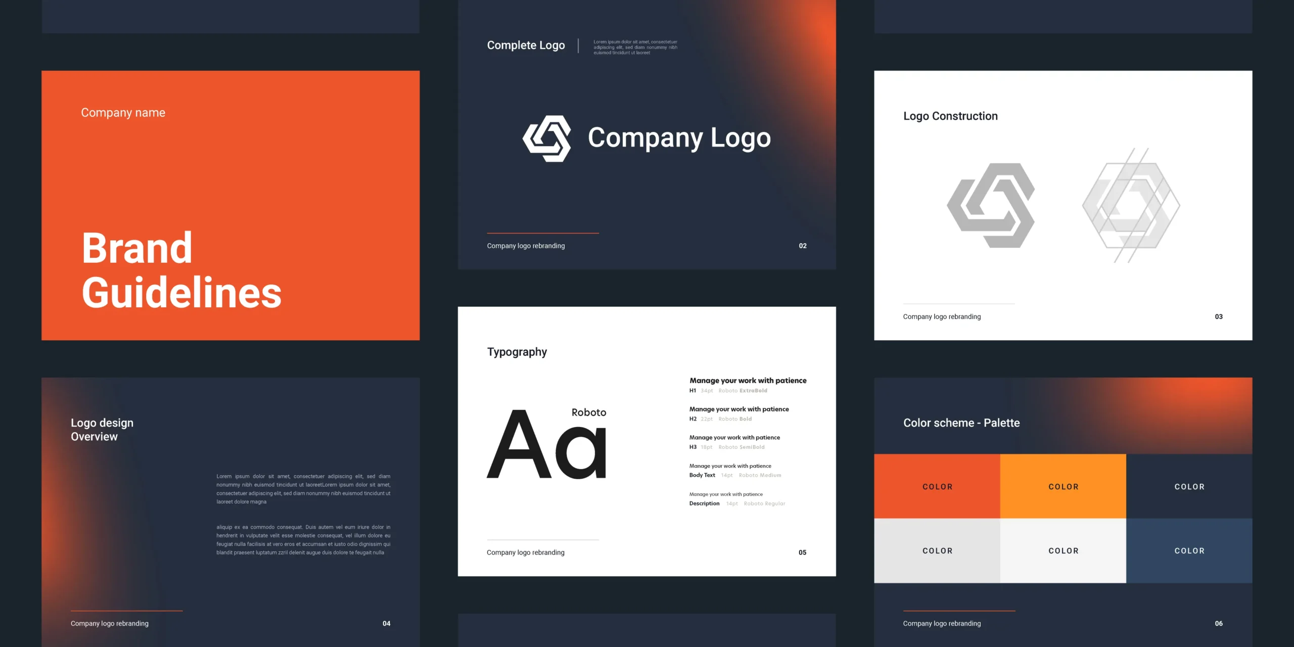
The rise of dark mode on web interfaces means that existing graphic guidelines need to be reviewed in depth. Adapting your graphic charter to dark mode requires a methodical approach to ensure sufficient contrast, preserve visual identity and offer a consistent user experience across all media. This article outlines the key steps to making this transition without sacrificing legibility.

Subtitle: dark graphics and optimum contrast
An effective dark graphic charter depends first and foremost on measured choices of contrast. Pure black (#000000) can tire the eye and overwhelm the nuances. Choose a very dark grey (#121212 or #1E1E1E) as the main background and reserve absolute black for borders or subtle shadows. Texts must achieve a contrast ratio of at least 4.5:1 against the background to remain legible according to the standards WCAG.
- Defining a dedicated colour palette
- Replace the light shades of your existing charter with dark equivalents, while maintaining colour harmony.
- For each text or element colour, calculate the contrast with the dark background using tools such as Contrast Checker.
- Keep the brand colours by adjusting their brightness and saturation so that they stand out against the dark background.
- Harmonising icons and illustrations
Using monochrome or two-tone illustrations makes it easier to integrate them into the dark graphic charter. Linear icons in white or in the colour of highly visible brands are preferable. More complex illustrations should be simplified to avoid details disappearing against a dark background. - Typography and visual hierarchy
- Select a medium weight font (400-600) for paragraphs and a high weight font (700-900) for headings.
- Increase the line spacing slightly (1.5) to prevent the letters from blending into the dark graphics.
- Adjust the minimum size to 16 px to remain legible on high-resolution and mobile screens.
- Shadow management and depth effects
Drop shadows help to distinguish layers without the need for sharp contours. On a dark background, use internal shadows (inset) or subtle gradients to simulate relief. A well-mastered dark graphic charter incorporates these effects in moderation to reinforce the visual structure without creating illegible areas. - Animation and user feedback
Animations and transitions should be discreet and quick so as not to distract from the essential. Apply micro-animations (hover, focus) using the brand colour and a slight increase in brightness. Test these effects in dark mode to check that they do not generate flickering or too low a contrast. - User testing and continuous validation
Organise test sessions with users on different devices and in different environments. Check contrast perception, icon clarity and text readability. Incorporate the feedback into your agile process so that you can regularly refine the dark graphic charter in line with actual usage. - Documentation and integration into the design system
Compile colour, typography and effect specifications in your design system. Precisely document CSS variables (custom variables or tokens) to facilitate the transition from a light theme to a dark theme. Rigorous documentation speeds up adoption of the dark graphic charter by all project contributors. - Technical implementation and dynamic switchover
Implement a theme system with a toggle in JavaScript or CSS Media Queries (preferences-color-scheme: dark). Make sure that all the dynamic elements (modals, notifications, third-party components) recover the dark colour variables correctly. Also test the site in mixed mode (certain light and dark elements) to avoid visual breaks.
Adapting your graphic charter to dark means more than simply reversing the colours. It involves a fine-tuned redesign that takes into account visual perception, the hierarchy of information and brand identity. By following these recommendations, you can guarantee a coherent dark experience that complies with accessibility standards and is faithful to your visual universe.


